link
Copy linkLink copied
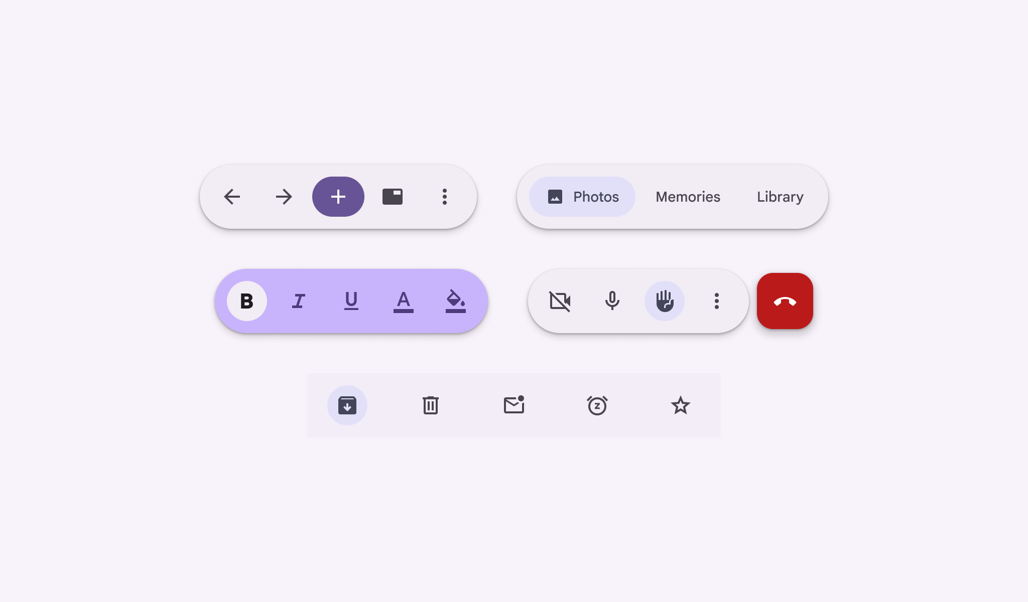
Toolbars can be used for a wide variety of use cases
link
Copy linkLink copied
Usage
link
Copy linkLink copied
Use a toolbar to provide actions related to the current page.
Toolbars can contain many actions and can scale to show more actions in larger windows.
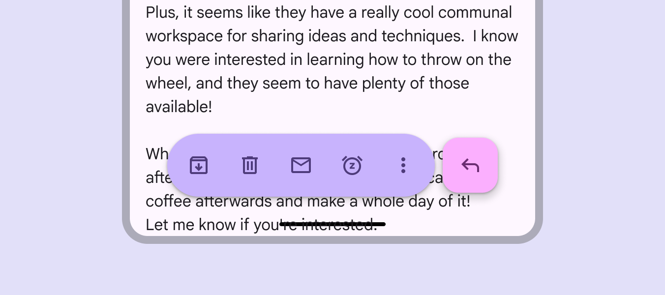
A toolbar provides actions related to the current page
link
Copy linkLink copied
There are two variants of toolbars:
Docked toolbar
Spans the full width of the window. It’s best used for global actions that remain the same across multiple pages.
Floating toolbar
Floats above the body content. It’s best used for contextual actions relevant to the body content or the specific page.
The baseline bottom app bar is no longer recommended, but is still supported.
link
Copy linkLink copied
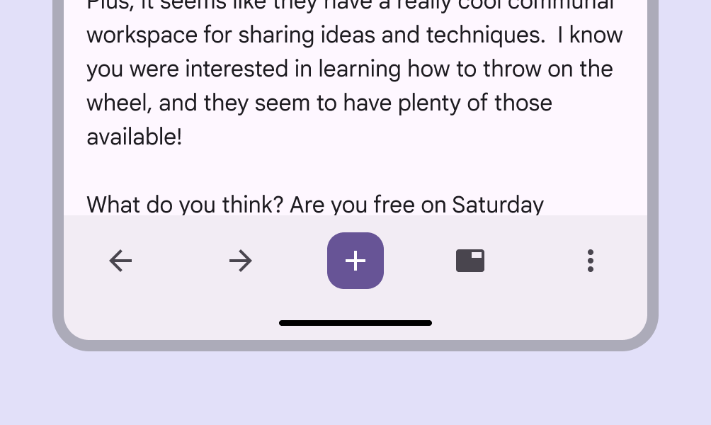
Docked toolbar shows global controls
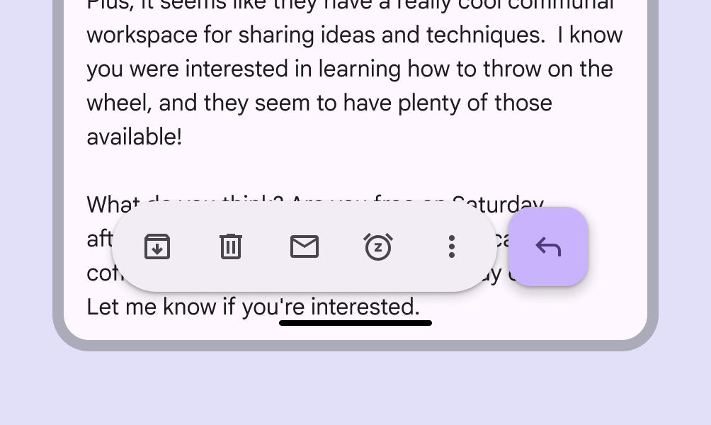
Floating toolbar show controls relevant to the current page
link
Copy linkLink copied
When actions don’t fit in a toolbar, add a menu Menus display a list of choices on a temporary surface. More on menus .
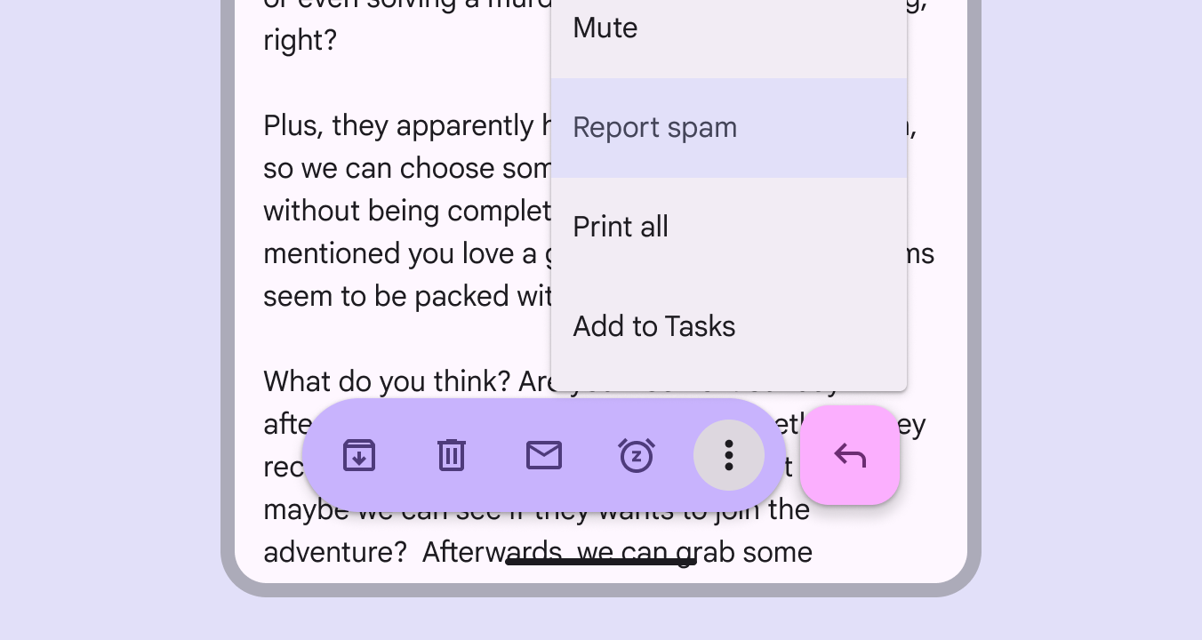
Toolbar actions can open a menu
link
Copy linkLink copied
There are two color configurations:
- Standard
A low-emphasis color scheme best used for focusing attention on the body content.
- Vibrant
A high-emphasis color scheme that draws attention to the controls. It can also indicate a temporary change in the page behavior, such as entering edit mode.
Consider using alternative color roles to create greater or lesser emphasis depending on the needs of the app. Experiment with different color roles to achieve different effects.
link
Copy linkLink copied
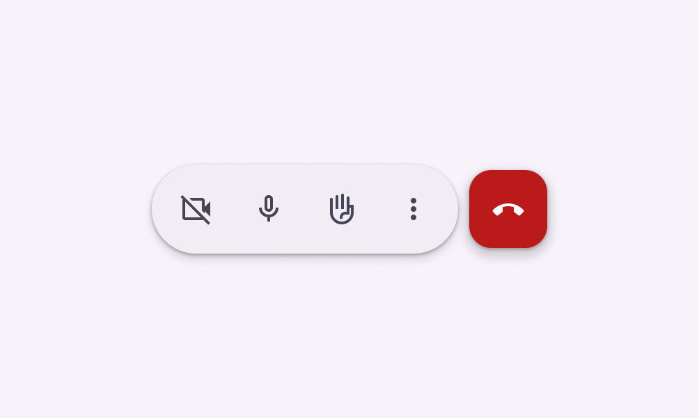
Use the standard color scheme to draw focus to content outside the toolbar
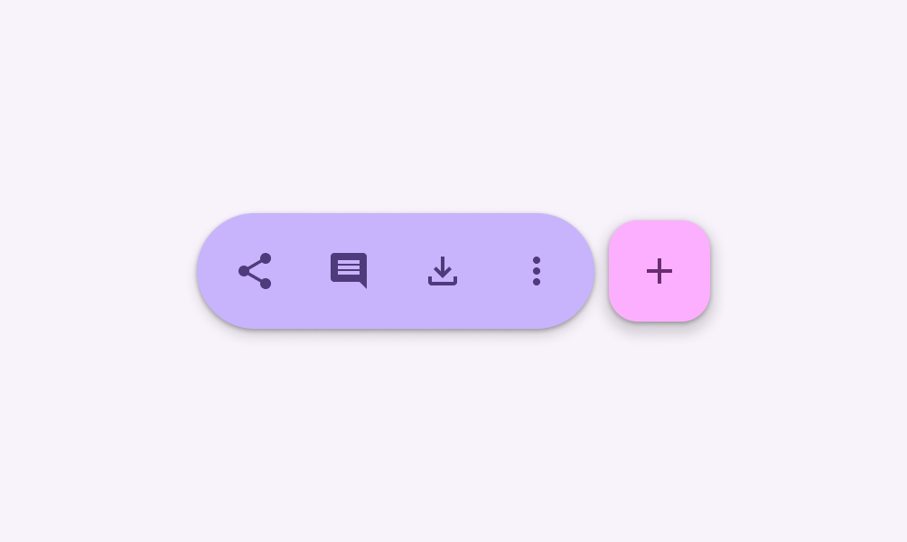
Use the vibrant color scheme to emphasize controls or actions
link
Copy linkLink copied
Toolbars & navigation bars
link
Copy linkLink copied
The toolbar and navigation bar Navigation bars let people switch between UI views on smaller devices. More on navigation bars are both placed at the bottom of the window, so should not be shown at the same time. Show the navigation bar on primary pages, and toolbars on subsequent pages with actions.
link
Copy linkLink copied
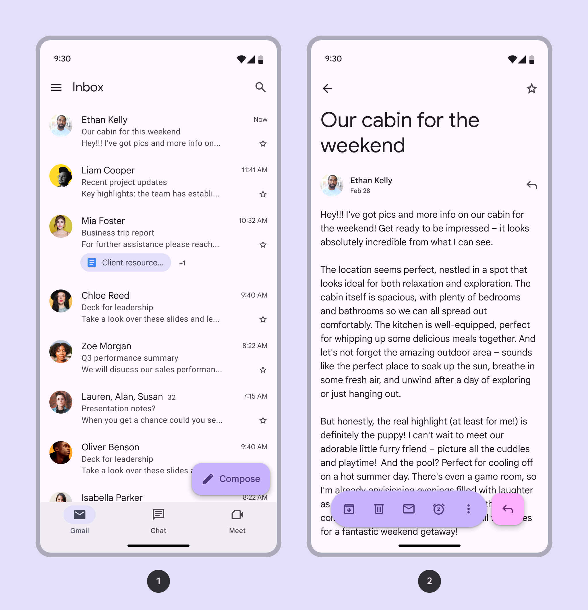
- Navigation bar on a primary page
- Toolbar on a secondary page with contextual actions
link
Copy linkLink copied
Floating toolbars can be used as tabs between related subsequent pages in the product hierarchy.
This helps group similar pages together, and shows that the selection affects the body content underneath.
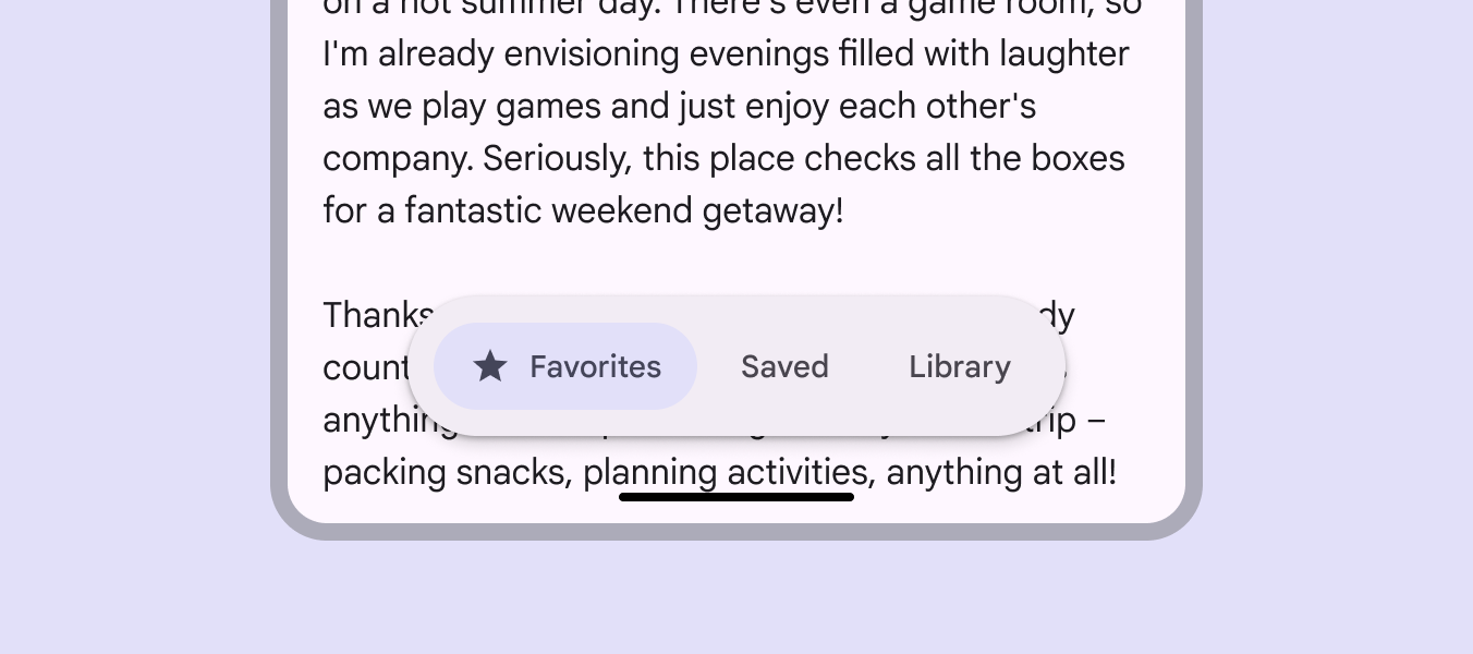
Keep navigation distinct, and use a toolbar to display local navigation on a specific page
link
Copy linkLink copied
Consider the existing app hierarchy when using a toolbar for local navigation.
Avoid redundant or confusing navigation combinations in the same view.
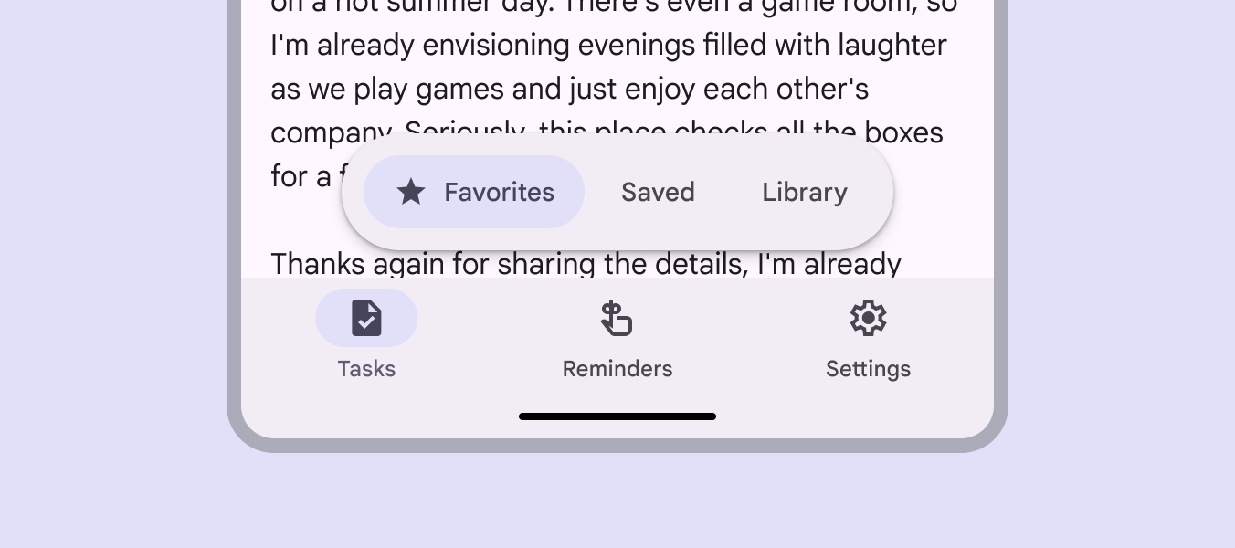
Don’t show a navigation bar and a toolbar with navigation controls at the same time
link
Copy linkLink copied
Anatomy
link
Copy linkLink copied
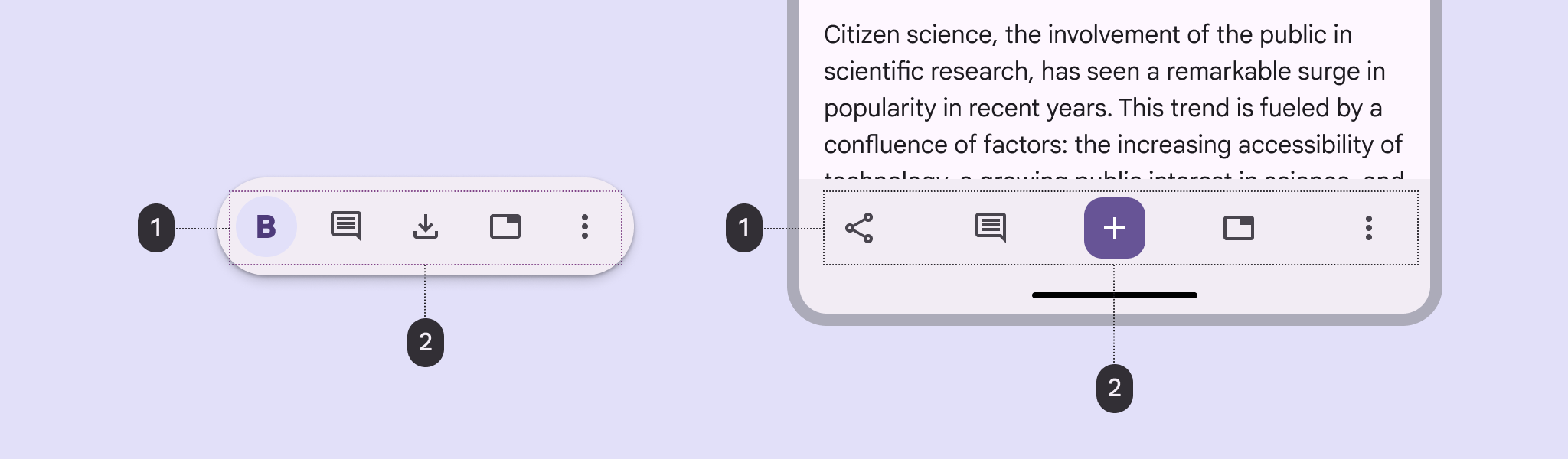
- Container
- Elements
link
Copy linkLink copied
Container
The docked toolbar’s container spans the full width of the window.
Avoid applying rounded corners to the container. This can imply the container expands or changes upon interaction.

Use straight corners for docked toolbars

Avoid modifying the container shape
link
Copy linkLink copied
As long as there's a minimum of 16dp padding on the leading and trailing edge, arrange controls inside however you see fit. The 32dp padding between items is just the default.
All elements need a minimum 48x48dp target area to be accessible.
Be cautious of including too many controls as it can be overwhelming.
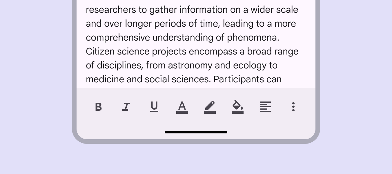
Don’t overwhelm people with too many controls
link
Copy linkLink copied
The floating toolbar’s container should be fully visible on screen. If more actions are needed, use an overflow menu.
link
Copy linkLink copied
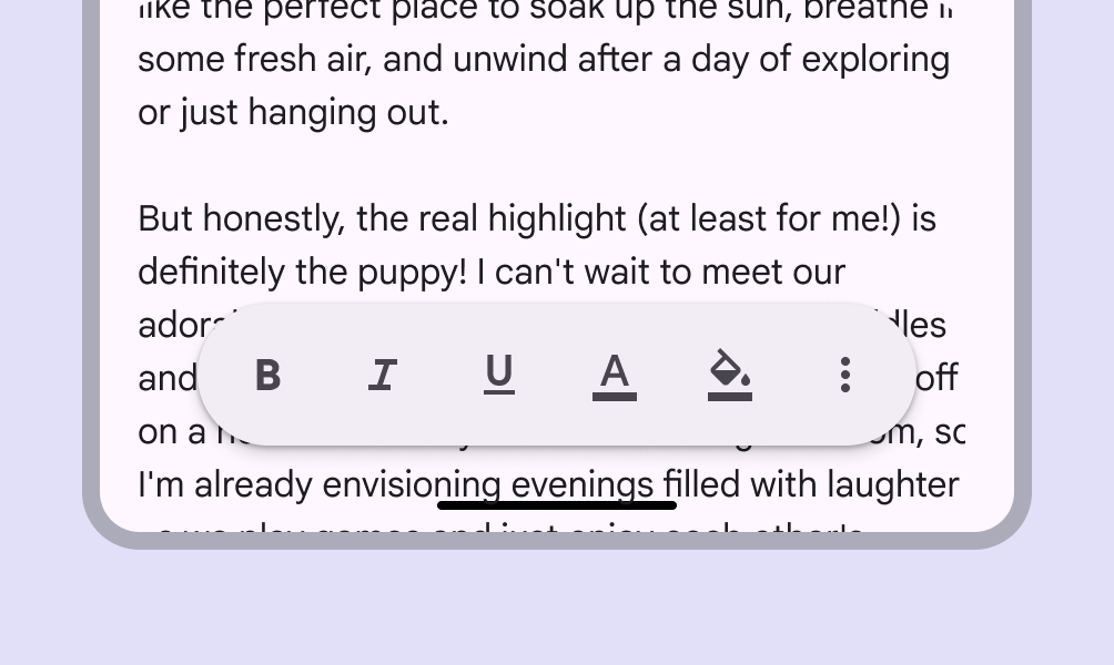
Choose the most essential actions to show on screen by default
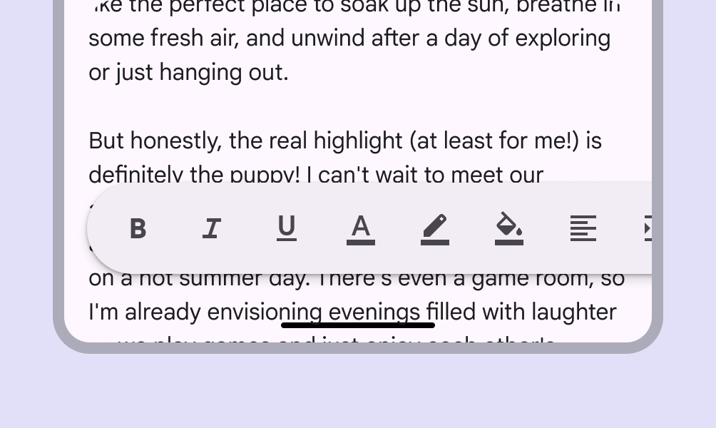
Floating toolbars shouldn’t exceed the edge of the window or pane
link
Copy linkLink copied
Elevation
Floating toolbars have elevation by default.
If the content beneath the toolbar is visually distinct, elevation can be removed.
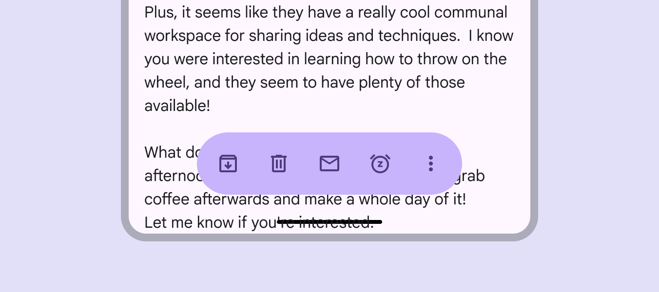
The elevation on floating toolbars can be removed if on a visually distinct background
link
Copy linkLink copied
Flexibility & slots
When configuring a toolbar, think of it as a container with several slots.
These slots can be populated by buttons Buttons let people take action and make choices with one tap. More on buttons , icon buttons Icon buttons help people take minor actions with one tap. More on icon buttons , images, text fields Text fields let users enter text into a UI. More on text fields , or any kind of custom component.
Icon buttons provide an even hierarchy of controls. Mixing in a filled icon button can help add emphasis to a single action.
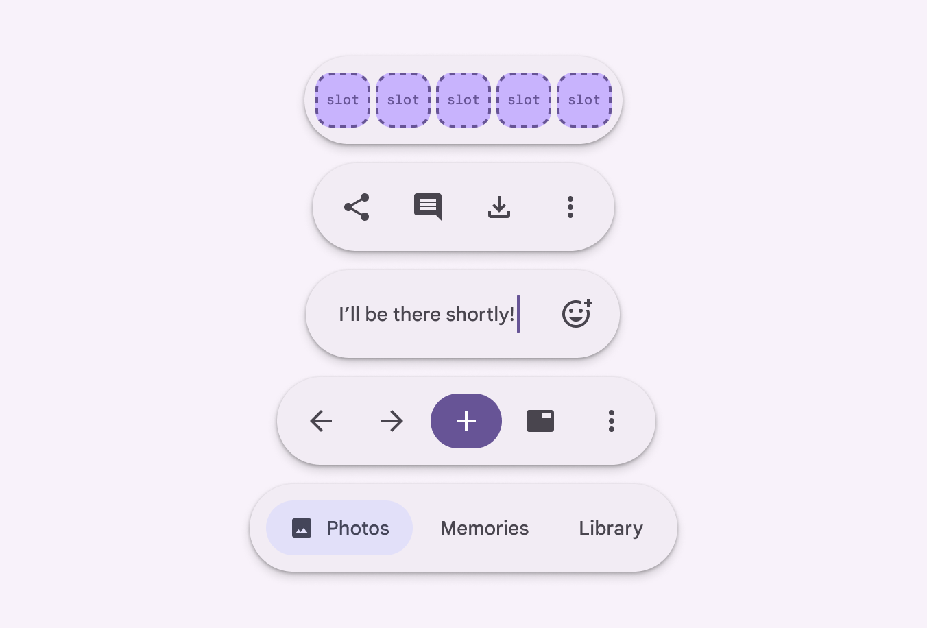
Toolbars are made of slots that can contain many kinds of actions
link
Copy linkLink copied
Visually emphasizing a single action more than others is an effective way to create hierarchy and guide people to controls they use most often. Avoid emphasizing more than one action at a time.
Some common ways to add emphasis to toolbar actions include:
- Use different icon button Icon buttons help people take minor actions with one tap. More on icon buttons color styles, such as filled, tonal, and standard
- Customize the color roles Color roles are assigned to UI elements based on emphasis, container type, and relationship with other elements. This ensures proper contrast and usage in any color scheme. More on color roles of a single action, such as a primary or secondary palette
- Use wide and narrow icon buttons
- Pair the toolbar with a FAB Floating action buttons (FABs) help people take primary actions. More on FABs
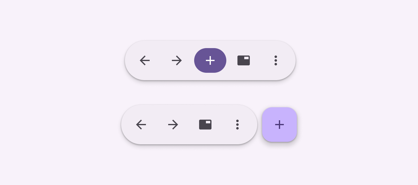
Two different ways to create a high emphasis action in toolbars
link
Copy linkLink copied
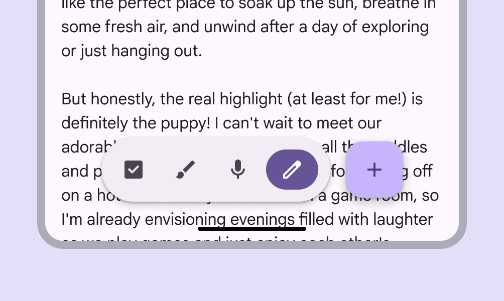
Don’t emphasize multiple buttons with bold, primary colors, such as a button and FAB together. Emphasize one action at a time.
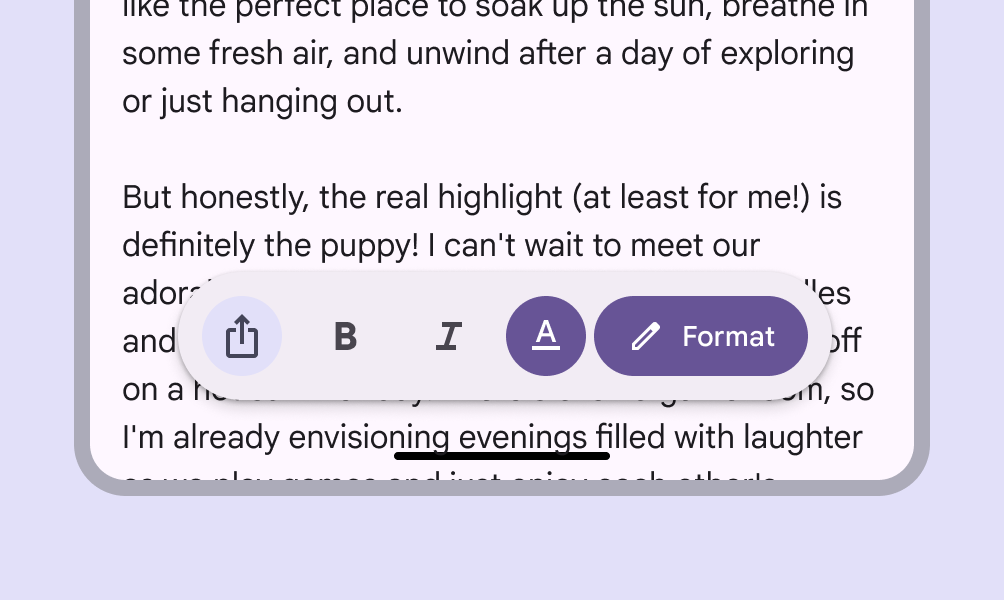
Avoid mixing too many different controls in the same toolbar. A consistent control design keeps things clear.
link
Copy linkLink copied
Avoid using square icon buttons in floating toolbars. Their square shape conflicts with the fully-rounded shape of the floating toolbar container.
Square buttons can be used in the docked toolbar.
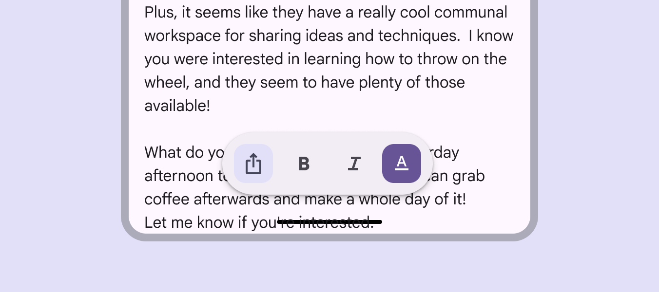
Don’t use square filled icon buttons in floating toolbars
link
Copy linkLink copied
Floating toolbar with FAB
A FAB Floating action buttons (FABs) help people take primary actions. More on FABs can be placed next to a floating toolbar to present one high-priority action alongside a unified set of toolbar actions.
Use a FAB for the highest-priority action in the view, or to complement the controls.
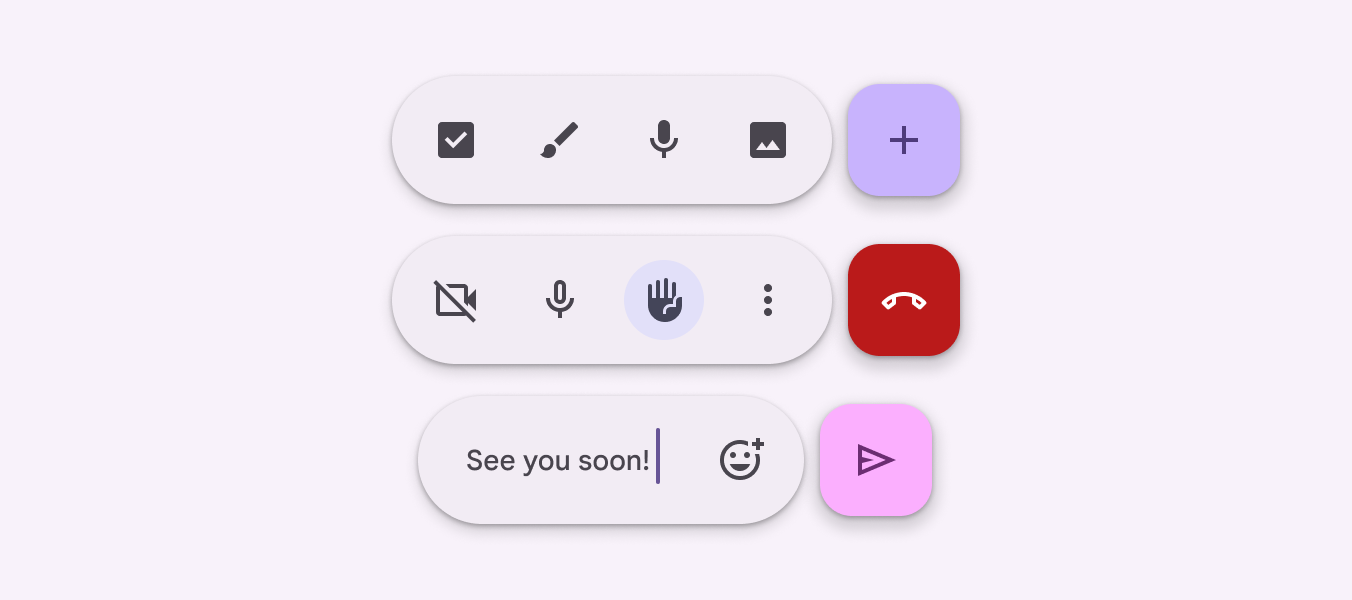
Floating toolbars can be paired with FABs
link
Copy linkLink copied
Position & orientation
link
Copy linkLink copied
Only place docked toolbars at the bottom of the window.
If using other bottom-aligned elements, such as a navigation bar, don't use a docked toolbar.
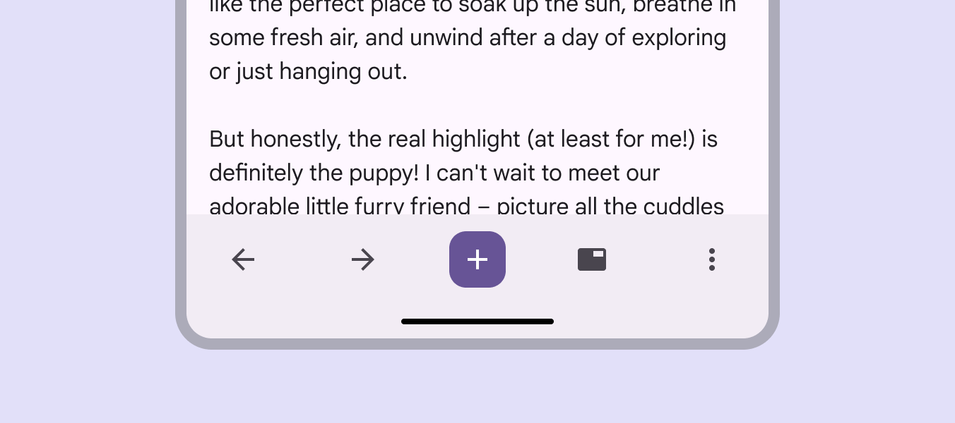
Docked toolbars are always at the bottom of the window
link
Copy linkLink copied
Floating toolbars can be horizontal or vertical.
Horizontal toolbars should have a minimum 16dp margin from the edge of the window.
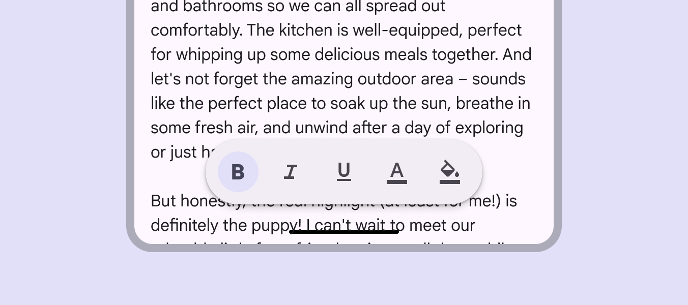
Horizontal floating toolbars should be at least 16dp from the edge of the window
link
Copy linkLink copied
In larger window sizes, floating toolbars can be vertical and placed on either side of the screen.
Vertical toolbars should have a minimum 24dp margin.
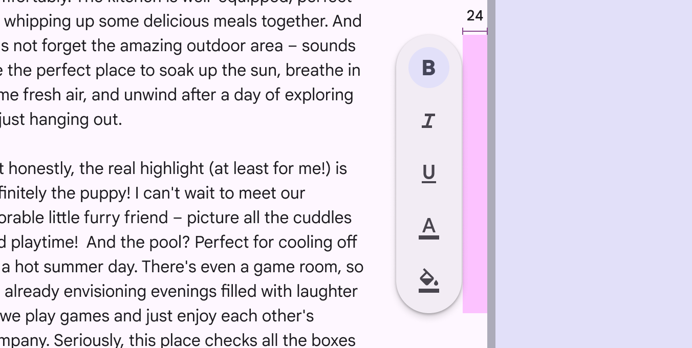
Maintain at least a 24dp margin for vertical toolbars
link
Copy linkLink copied
To keep vertical toolbars compact, don’t use wide icon buttons.
Use narrow or default icon buttons instead.
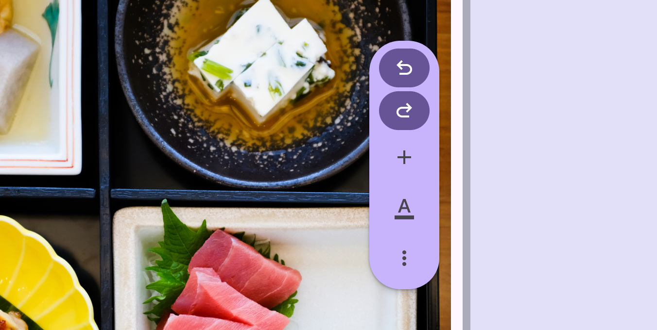
Using wide buttons with vertical toolbars can unnecessarily widen toolbar containers and hide other UI elements
link
Copy linkLink copied
Vertical toolbars should be positioned opposite the navigation rail Navigation rails let people switch between UI views on mid-sized devices. More on navigation rails to balance out the screen and keep actions easy to access.
When showing a navigation rail and vertical floating toolbar at once, use the centered configuration of the navigation rail.
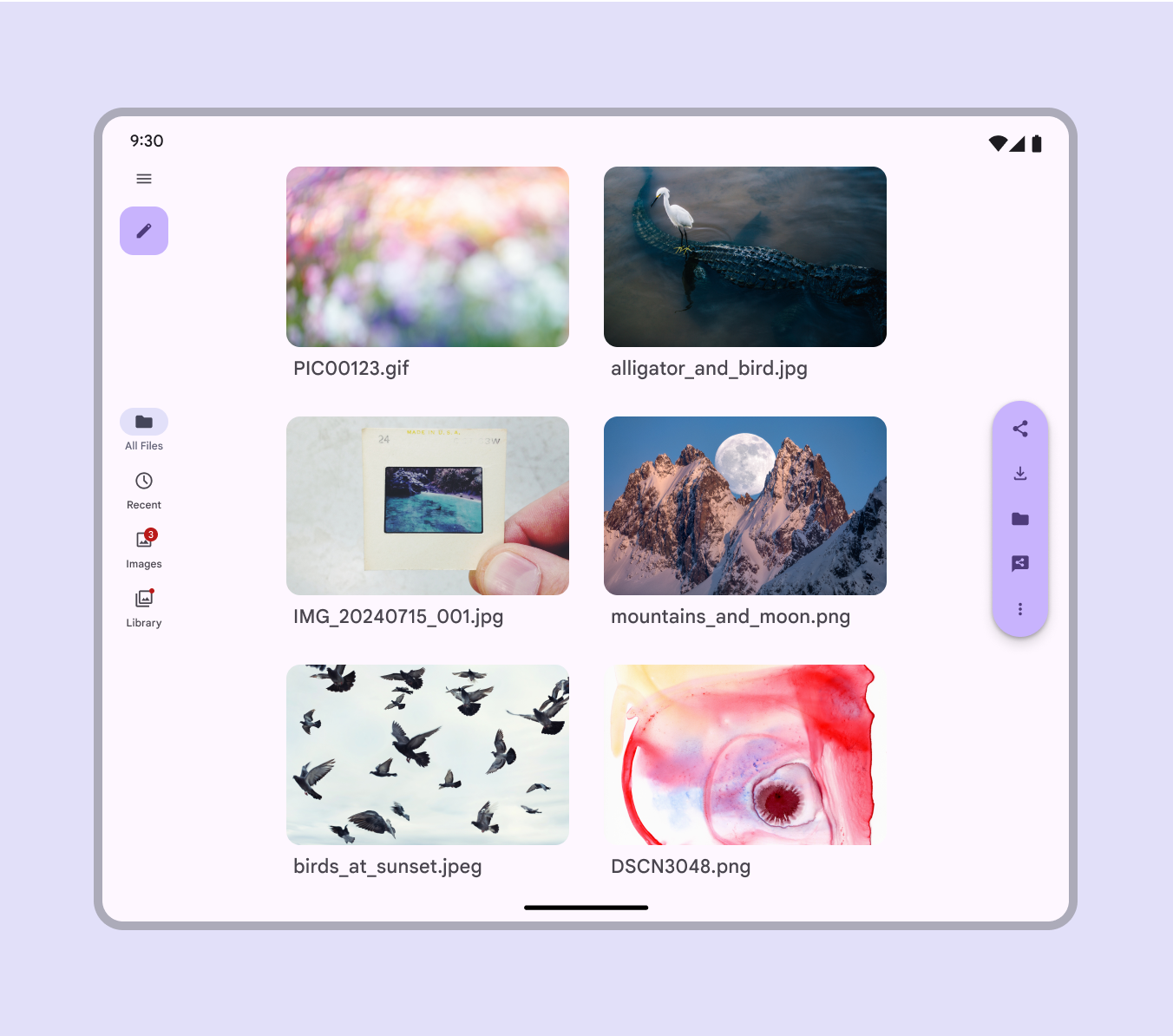
When a nav rail is visible, the floating toolbar should be vertical on the opposite edge of the window
link
Copy linkLink copied
Adaptive design
link
Copy linkLink copied
Adaptive design allows an interface to respond or change based on context, such as the user, device, and usage. More on adaptive design
link
Copy linkLink copied
Resizing
link
Copy linkLink copied
Docked
The docked toolbar should always span 100% of the screen width.
In compact window sizes Window widths smaller than 600dp, such as a phone in portrait orientation. More on compact window size class , elements in the toolbar should be evenly spaced.
In medium window sizes Window widths from 600dp to 839dp, such as a tablet or foldable in portrait orientation. More on medium window size class and larger, adjust the padding between controls to create a comfortable layout. This can be achieved by:
- Centering all elements
- Customizing to center a key action, and aligning other elements to the edges
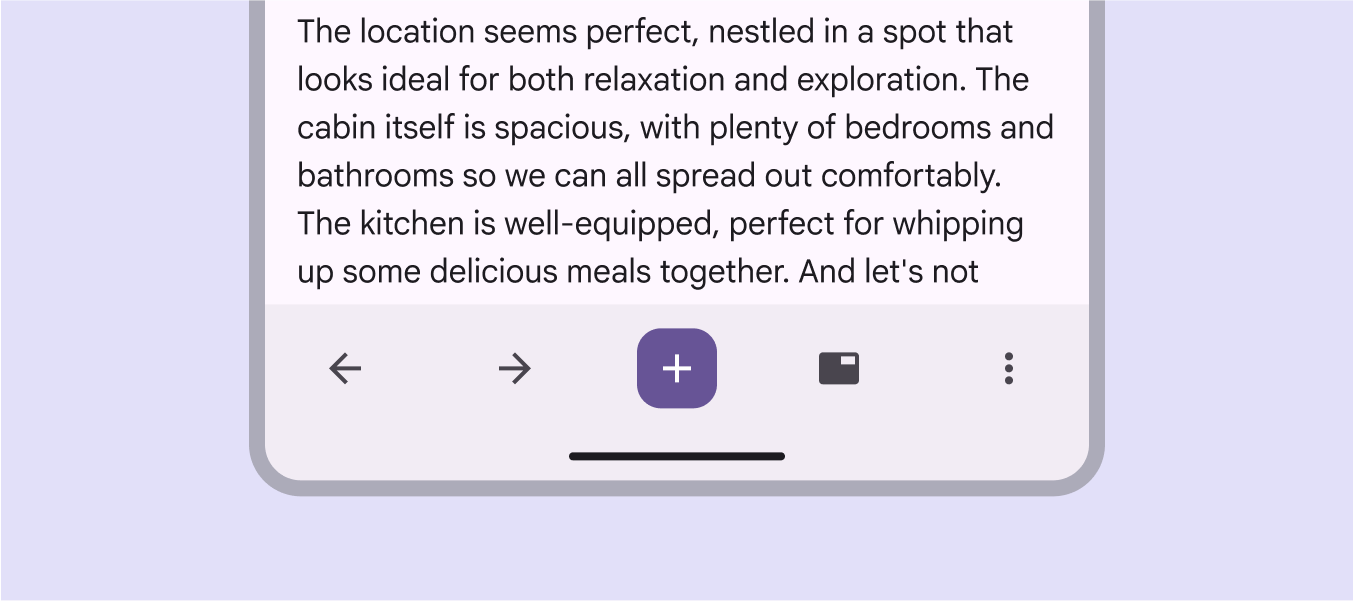
Docked toolbar items should be evenly spaced in compact windows
link
Copy linkLink copied
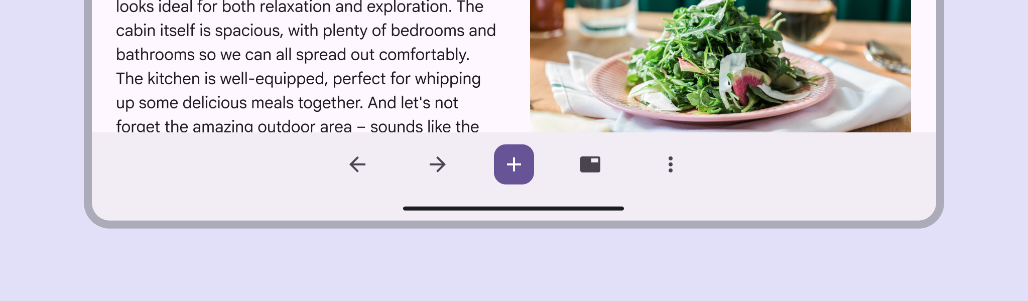
In medium window sizes and larger, create a spacious layout by centering all elements
link
Copy linkLink copied
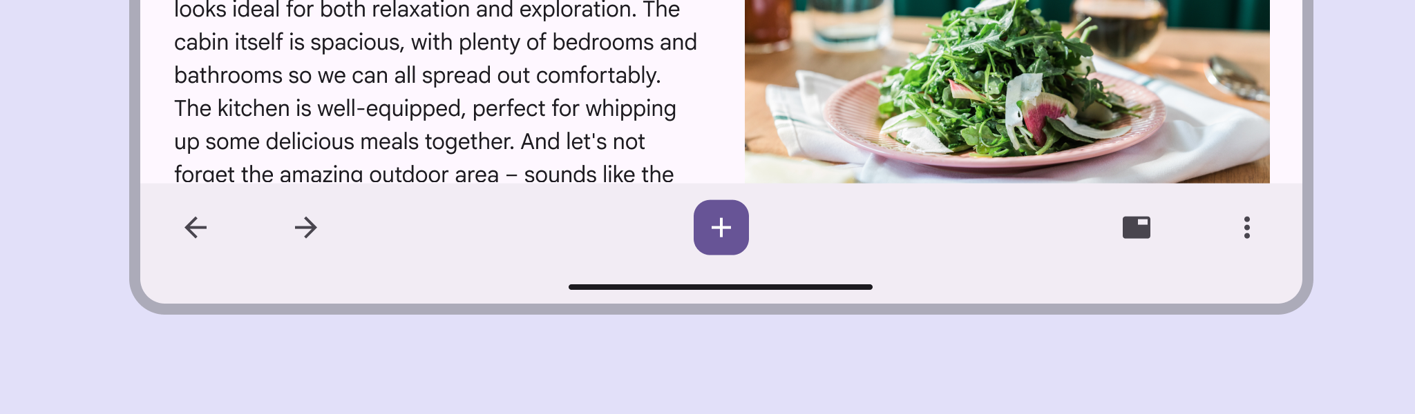
Align controls to the edge of the screen to make them easier to reach on tablets, and to better highlight a primary action in the middle
link
Copy linkLink copied
On web and large screens, the docked toolbar can be rounded. Dividers can be used to organize large amounts of items. Only shrink the height and use extra small buttons if vertical space is limited.
link
Copy linkLink copied
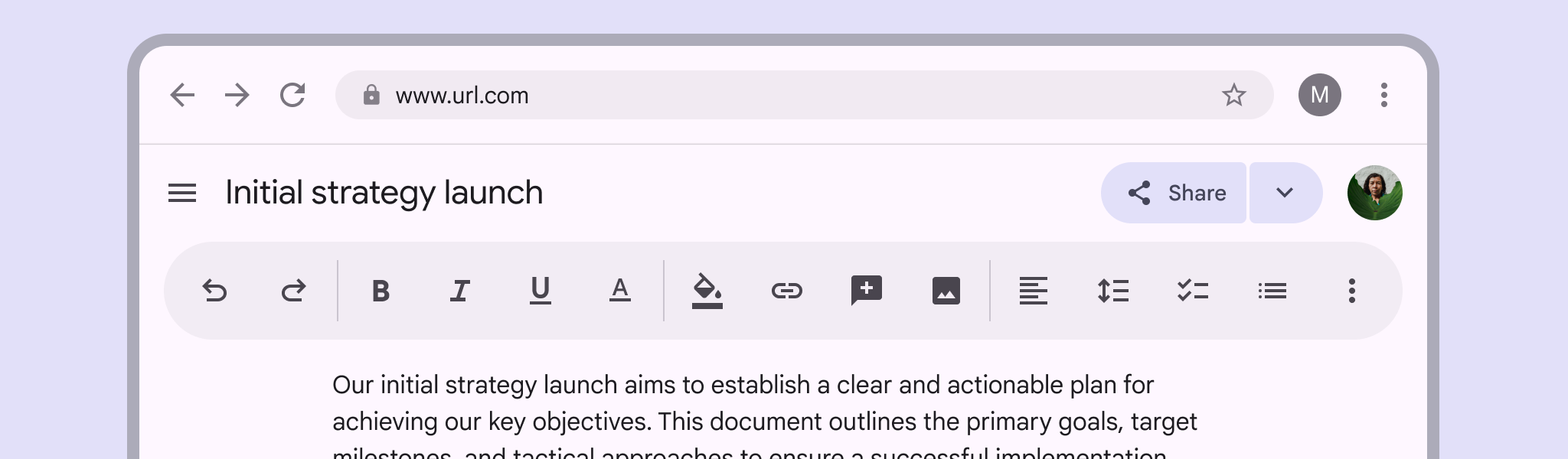
On web and other large screens, docked toolbars can be rounded and placed in different parts of the page
link
Copy linkLink copied
Floating
The container should only be as big as needed to hold the items inside before reaching the 16dp margin.
If there’s not enough space for all items, put them in an overflow menu in the trailing slot. As the window size expands, more actions can be revealed.
The floating toolbar width can also be capped to keep it smaller and hide more elements.
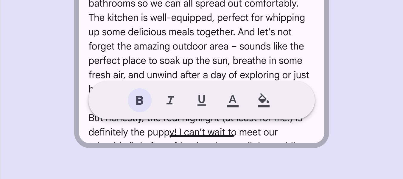
Don’t add extra space to a toolbar beyond its necessary items
link
Copy linkLink copied
.png?alt=media&token=415f33b0-19f9-4b55-87e1-d94689e61122)
At larger screen sizes, the container can display more controls before hitting the 16dp margin
link
Copy linkLink copied
Vertical toolbars aren’t recommended for compact windows.
They take up a significant area of the screen and may feel visually overwhelming, especially on screens with complex layouts.
Only use them when the screen is simple or when the toolbar has a few controls.
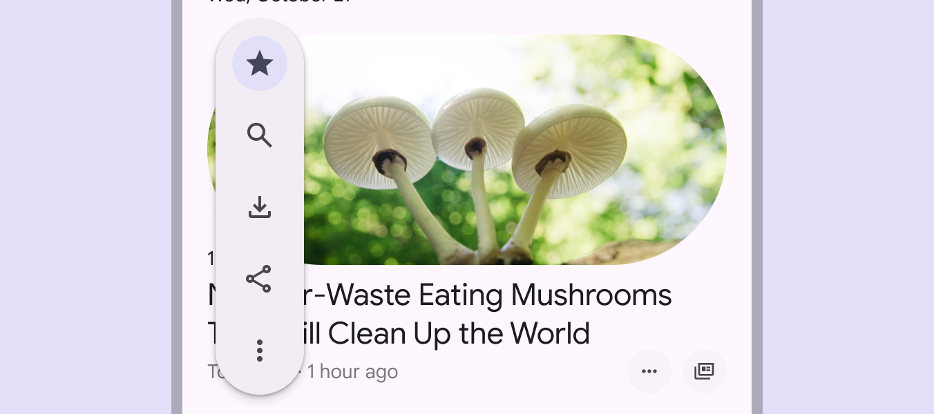
Vertical toolbars can cover important content in compact windows
link
Copy linkLink copied
Presentation
link
Copy linkLink copied
In larger window sizes, floating toolbars can be aligned to opposite edges of the screen so they're easy to reach and group similar actions. For example, consider placing the undo and redo actions in one toolbar, and editing controls like highlight, erase, and select in another. Stylistic differences can help emphasize each toolbar’s purpose and clarify hierarchy.
link
Copy linkLink copied
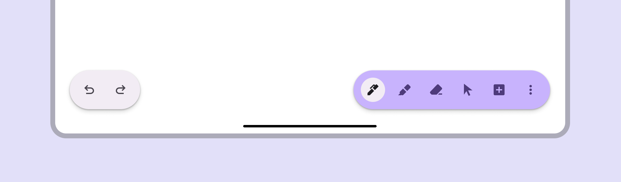
Multiple toolbars with different stylistic treatments can create hierarchy and distinguish different kinds of actions
link
Copy linkLink copied
Don’t use multiple toolbars in compact windows. There typically isn’t enough room on screen.
Instead, use one toolbar for all actions.
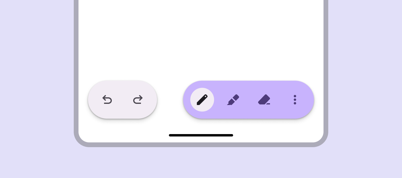
Avoid using multiple toolbars in smaller windows
link
Copy linkLink copied
Actions at the trailing edge of the toolbar can collapse into an overflow menu at smaller window sizes, and become visible again at larger sizes.
Actions at the trailing edge collapse into an overflow menu
link
Copy linkLink copied
Right-to-left languages
In right-to-left (RTL) languages, mirror individual items that need it, like icons and text direction. If the order of actions is important, flip the order of the actions as well.
link
Copy linkLink copied
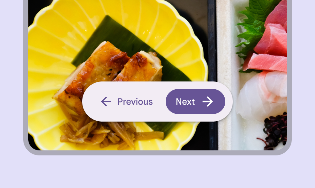
In LTR languages, the Next button is intentionally placed on the trailing (right) edge
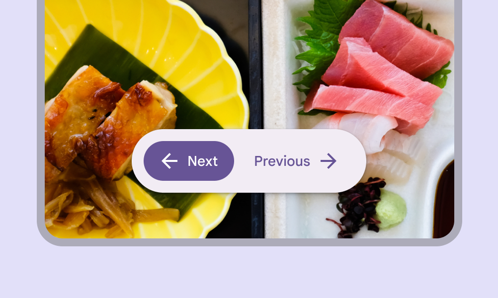
In RTL languages, reverse the order so Next remains on the trailing edge when flipped, now on the left. Text is not translated to illustrate mirroring.
link
Copy linkLink copied
Behavior
link
Copy linkLink copied
Scrolling
Docked toolbars can either remain on the screen during scroll, or animate offscreen.
Docked toolbars can animate offscreen
link
Copy linkLink copied
Floating toolbars can remain on the screen, animate offscreen, or collapse into a single, high-emphasis action on scroll.
Floating toolbars can animate off screen
link
Copy linkLink copied
On Jetpack Compose, the floating toolbar can collapse to a FAB or key action on scroll.
Floating toolbars can be customized to do other actions on scroll, like collapse into a single action
link
Copy linkLink copied
Don't collapse actions and scroll at the same time.
Toolbars shouldn't both collapse and transition off page